

Cart
0
-
Most people approach cushion cover mixing by buying patterns they like individually and hoping they will work together. Sometimes they do. Often they produce a sofa or a bed that looks as if the cushions arrived from several different households and settled there by accident.
The difference between a random collection of cushions and a considered one is not a question of taste or budget. It is a question of a few specific principles that designers apply consistently. Once understood, these principles make the mixing decision considerably more straightforward than staring at options and hoping for the best.
The Foundation: The Palette Comes First
Before choosing any individual cushion cover, establish the palette for the arrangement. This means identifying two or three colours that will appear across all the cushions, in different proportions, across different prints.
The palette is usually derived from the room rather than invented for the cushions. Look at the sofa colour, the rug, the walls, the largest piece of furniture. The colours already present in the room are the colours the cushion palette should draw from.
For an Indian living room with wooden furniture, terracotta-toned walls, and a cream or beige sofa, the palette might be: warm terracotta, deep green, cream. Every cushion cover chosen should contain at least one of these three colours. Some will lead with terracotta, some with green, some will be predominantly cream with terracotta accents. The palette is what holds them together even when the prints are completely different.
Scale: The Rule That Resolves Most Problems
Every designer who mixes prints uses a scale rule. The rule is this: vary the scale of the prints significantly, and the combination almost always works. Use prints at the same scale, and they compete.
In practical terms: a large-scale botanical print cushion, a mid-scale geometric cushion, and a small-scale ditsy floral cushion, all in the same two or three colour palette, will almost certainly work together. The different scales give each print its own visual territory.
The same three prints at similar scales, even in the same palette, fight each other for attention. The eye moves between them without settling anywhere and the arrangement reads as busy rather than curated.
When in doubt: make sure the largest print in the arrangement is at least twice the scale of the next print. This is the threshold at which the two prints read as different rather than competing.
Texture as a Neutral
Plain cushion covers serve a specific and underappreciated function in a mixed arrangement: they provide visual rest. A plain cushion in a solid colour from the shared palette gives the eye somewhere to settle between the printed pieces.
But texture in a plain cover makes it far more interesting than a flat-woven solid. A plain cushion in a jacquard weave, where the pattern is in the texture of the fabric rather than printed on the surface, has visual depth without competing with the printed cushions around it. It reads as a rest rather than a gap.
In a set of four cushion covers: two printed and two plain is a reliable combination. Two printed in different scales and two in a textured plain from the shared palette produces an arrangement that is active and restful in the right proportions.
Odd Numbers Work Better Than Even
Designers tend to use odd numbers of cushions in an arrangement. Three on a sofa, five on a bed, one on a chair. This is not superstition: odd numbers produce asymmetry, and asymmetry reads as natural and relaxed rather than arranged.
An even number of cushions, two on each side of a sofa, four in two pairs on a bed, produces bilateral symmetry that can read as formal or rigid. It can work, particularly in a formal or minimalist room. For most Indian living rooms and bedrooms, which tend toward warmth and informality, an odd number of cushions reads more naturally.
The practical application: if buying four cushion covers, consider using three on the sofa and keeping one in reserve, or placing three on the sofa and one on an adjacent chair.
The Mistake Almost Everyone Makes
The most common cushion mixing mistake is introducing a print that contains colours not present anywhere else in the room.
A new colour introduced only through a cushion cover has no relationship to the room and the cushion looks as if it arrived by mistake rather than by design. Even if the print is beautiful in isolation, it creates a disconnect that the eye registers as wrong without necessarily being able to name the reason.
The solution is simple: before buying any cushion cover, hold it against or near the primary elements of the room and check whether the colours in the print appear elsewhere in the space. If none of the colours in the print appear anywhere else in the room, either choose a different cover or be prepared to introduce that colour in one additional element somewhere else, a throw, a vase, a piece of art.
A Practical Formula for a Sofa
For a three or four cushion arrangement on a standard sofa, this formula produces a reliably good result.
One large-scale botanical or floral print in the established palette, this is the dominant cushion.
One medium-scale geometric or stripe in two of the same palette colours, this is the supporting print.
One or two plain cushions in a jacquard or textured weave in the deepest tone in the palette, these are the resting points.
This combination works because it has variety in scale, variety in print type, and the plains provide visual rest. The palette holds it together.
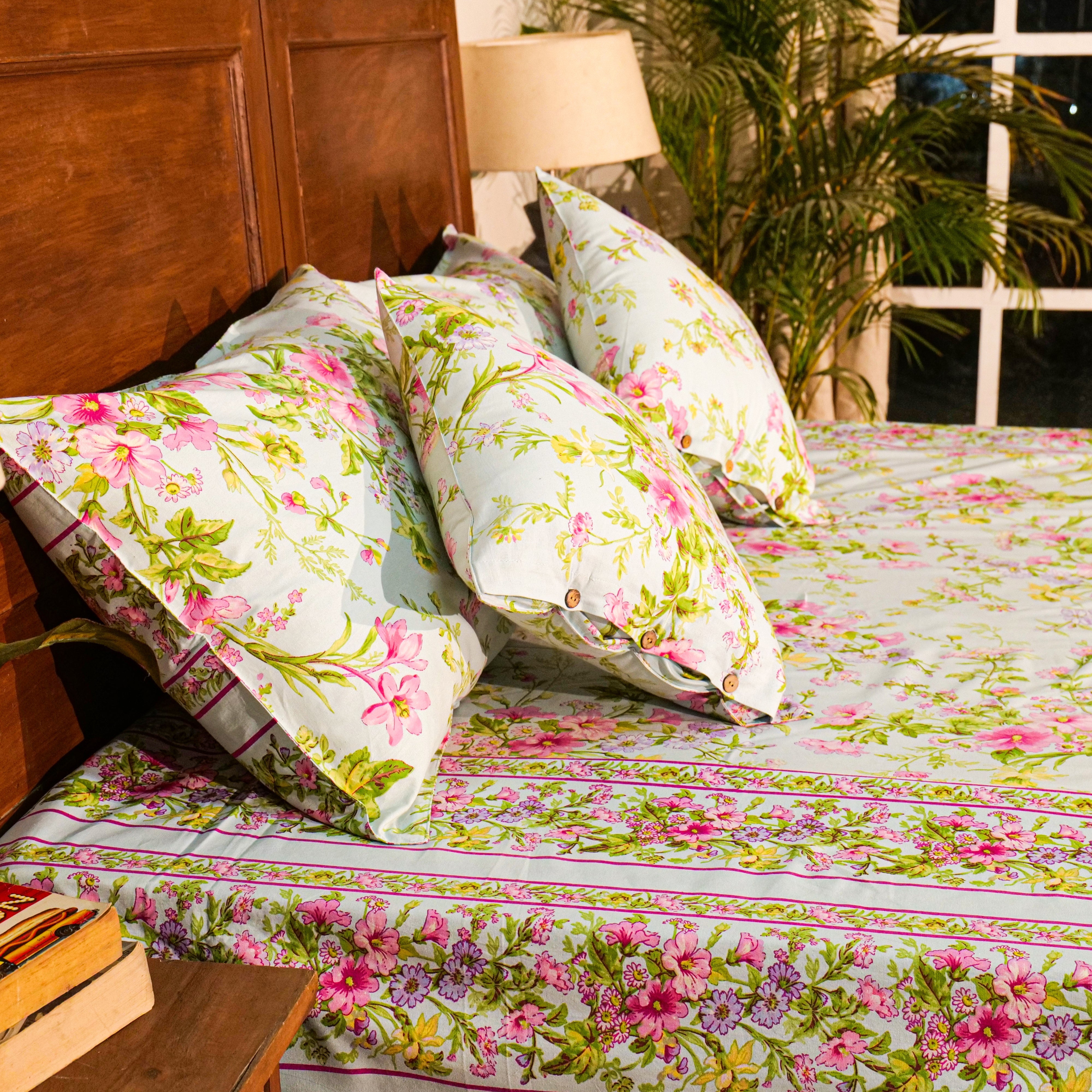
A Practical Formula for a Bed
For a four to six cushion arrangement at the head of a bed, in front of the sleeping pillows.
Two larger cushion covers in the dominant print of the room, typically coordinating with the bed cover.
Two cushion covers in a plain or very subtle texture in one tone from the bed cover print.
Optional: one or two smaller cushion covers in a contrasting print at a much smaller scale than the dominant one.
The arrangement goes largest and plainest at the back, moving to smaller and more detailed at the front. This is how the eye naturally travels: from the broad strokes to the fine details.
Frequently Asked Questions
How do you mix cushion covers without it looking random? Establish a palette of two to three colours drawn from the room before choosing any individual cover. Vary the scale of the prints significantly. Include at least one plain or textured plain cover as a visual resting point. Every cover chosen should contain at least one colour from the established palette.
Can you mix floral and geometric cushion covers? Yes. A large-scale floral and a small-scale geometric in the same colour palette is one of the most reliable combinations available. The organic irregularity of the floral and the regularity of the geometric complement each other. The key is that the scale of the two prints should be significantly different.
How many different prints can you use on one sofa? Two to three different prints plus one or two plains is the practical maximum for most sofas. Beyond three different prints at the same scale, the arrangement reads as busy. Varying the scale of the prints significantly extends the number that can work together.
Should all cushion covers on a sofa be the same size? No. Mixing sizes, large cushions at the back and smaller ones in front, produces a more layered and considered arrangement than uniform sizing. The variation in size adds depth to the arrangement in the same way that variation in print scale does.
What is the easiest way to mix cushion covers for a beginner? Start with one printed cushion cover you love. Identify the two or three colours in it. Choose one plain cushion in the deepest of those colours and one plain in the lightest. These three cushions will work together because the palette is already established by the first choice. Add a fourth in a different print at a different scale once confident.
Mixing cushion covers well is a learnable skill rather than an innate talent. The palette comes first, the scale varies, the plains provide rest, and the colours in each cover have a relationship with the room it is going into.
Applied consistently, these principles produce a sofa or a bed that looks as if someone with a good eye put it together, which is precisely what they are designed to do.
Shop printed and floral cushion covers at April Cornell India.
Suggested tags: mix and match cushion covers, cushion cover combinations, cushion styling tips, decorative cushions India, sofa cushion ideas, bedroom cushion styling, home decor India