

Cart
0
-
Floral prints in home decor divide people sharply. Some find them warm, layered, and full of character. Others find them overwhelming and difficult to live with. The difference between the two experiences is almost always a question of how the florals were used rather than whether they were used at all.
A single well-chosen floral piece in the right place transforms a room. Three competing floral prints at three different scales in the same room produce something that the eye cannot rest in. The principle that separates these two outcomes is not complicated, but it is worth understanding clearly before reaching for a floral tablecloth or a printed bed cover.
Why Floral Prints Work in Indian Homes
Indian interiors have a natural affinity with floral and botanical prints that is worth naming before getting into the practical guidance.
Indian craft traditions, block printing, hand embroidery, jacquard weaving, have produced floral textile motifs for centuries. The rose, the lotus, the jasmine, the marigold: these are not foreign imports. They are woven into the visual language of Indian domestic life. A floral tablecloth on an Indian dining table does not look like an imported Western aesthetic. It looks like a continuation of something already present in the home.
This is the reason that April Cornell's floral and botanical prints, while drawing on a vintage Western sensibility, work as naturally as they do in Indian interiors. The meeting point is genuine rather than imposed.
The Scale Question
Floral prints come in three scale categories and the scale determines where in the room each print belongs.
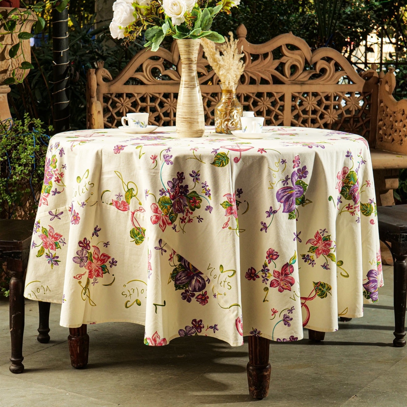
Large-scale florals: flowers that measure 10cm or more across the print. These are statement prints. They read from across the room and carry the decorative weight of a surface on their own. A large-scale floral tablecloth does not need a runner, a bold centrepiece, or patterned napkins on top of it. It needs space to be seen.
Mid-scale florals: flowers in the 4 to 10cm range. These are the most versatile and the most widely applicable. They work on tablecloths, bed covers, cushion covers, and napkins. They read as decorative without dominating and they coordinate more easily with other patterns.
Small-scale florals: tight repeated prints with individual flowers under 4cm. These work best as secondary prints: the napkin that coordinates with a large-scale tablecloth, the pillowcase that works alongside a bolder bed cover. They add texture rather than making a statement.
The mistake most commonly made with florals is using a large-scale print in a position where it cannot be seen properly, a small bedside table runner, for example, or a napkin so tightly folded that the print disappears. Scale and placement work together.
One Floral Per Surface Level
The most practical rule for using florals in any room: one floral print per surface level.
In a dining room, the surface levels are the table (tablecloth), the wall (any art or decoration), and the floor (rug or flooring). One floral at each level is the maximum before the room starts to feel busy. In practice this means: a floral tablecloth on the table, plain or subtly textured walls, and a plain or geometric rug. Or: a plain tablecloth on the table, a botanical print runner, and a floral print in the art on the wall.
In a bedroom, the surface levels are the bed, the walls, and the floor. A floral bed cover on the bed with plain walls and a plain rug. Or a plain bed cover with floral cushion covers on a bed against a gently patterned wallpaper.
The rule is a guide rather than a law. It is possible to use florals at two surface levels in the same room and have it work: the key is that one of the florals should be significantly quieter than the other, smaller in scale or softer in colour, so the two do not compete for the eye's attention.
Combining Florals With Other Patterns
Florals work well alongside certain other pattern types and poorly alongside others. Understanding the combinations saves a significant amount of expensive trial and error.
Florals and stripes: a classic combination that has worked in textile design for over a century. The geometric regularity of a stripe provides visual rest for the eye after the organic irregularity of a floral. A floral tablecloth with striped napkins. A floral bed cover with striped pillowcases. The key is that the stripe should pick up one colour from the floral rather than introducing an entirely new palette.
Florals and plains: the safest and most widely applicable combination. A plain element in one of the colours within the floral print grounds the setting and gives the floral room to work. A floral tablecloth with plain napkins in the deepest tone in the print. A floral bed cover with plain cushion covers in the background colour of the print.
Florals and geometrics: this works when the scale of the two prints is very different. A large-scale floral with a small-scale geometric in a similar palette. When both prints are at the same scale, they compete.
Florals and paisleys: both are organic, flowing prints and they can work together when the colour palette is consistent. A floral tablecloth in corals and greens with a paisley runner that uses the same coral and green. The shared palette is what holds them together.
Florals and other florals: two florals in the same room need to be at different scales and in a shared palette. A large-scale rose print bed cover with a small-scale ditsy floral on the pillowcases. Different scale, same palette. Two large-scale florals in different palettes in the same room is almost always too much.
Colour in Floral Prints
The background colour of a floral print does as much work as the flowers themselves.
A floral on a white or cream background is light, open, and summery. It reads as fresh and is easier to combine with other elements because the neutral background gives the eye somewhere to rest.
A floral on a deep coloured background, a dark teal, a rich navy, a warm terracotta, is richer and more dramatic. It reads as evening rather than daytime and works particularly well for festive table settings or in bedrooms where warmth and enclosure are the intended feeling.
A floral on a mid-tone background, soft sage, dusty rose, warm aqua, is the most versatile of the three. It carries the warmth of a coloured ground without the formality of a very dark one.
For Indian homes specifically, florals on warm-toned backgrounds, ivory, blush, soft gold, work particularly well because they pick up the warmth of wooden furniture, terracotta floors, and the general palette of Indian interiors.
Where to Use Florals in an Indian Home
The dining table is the natural home for floral table linen. A floral tablecloth in a mid-scale botanical or rose print in a warm palette sits easily on any Indian dining table and does most of the decorative work for the room on its own.
The bedroom is the second natural home. A floral bed cover defines the room from the doorway and creates the warm, layered quality that makes a bedroom feel restful and inhabited rather than clinical.
Cushion covers are the lowest-risk way to introduce a floral if the rest of the room is plain. They can be changed easily and they make a visible difference to a sofa or bed at low cost and with no permanent commitment.
The kitchen, through aprons and tea towels in floral prints, introduces warmth to a space that is usually utilitarian.
What to Avoid
Two large-scale florals in the same colour family in the same room. They merge rather than complement.
A floral print in a colour that has no relationship to anything else in the room. A tablecloth in a cool blue-and-white floral on a warm wooden table surrounded by terracotta walls. The print looks isolated rather than part of the room.
Trend-dependent floral colourways applied to permanent or expensive items. A tablecloth or bed cover in a trending colour combination may look dated within two or three years. Warm, classic palettes, the botanicals, the vintage roses, the soft paisleys in corals and greens, have remained consistent in appeal for decades and are safer for larger purchases.
Frequently Asked Questions
How do you use floral prints in home decor without it looking too busy? Use one dominant floral print per surface level in a room. Combine the floral with plains in colours drawn from the print rather than with other bold patterns. Keep the background colour of the floral in mind: a floral on a neutral ground is easier to live with than one on a very saturated background. Allow the floral enough space to be seen rather than surrounding it with competing elements.
What prints go well with floral home decor? Stripes in a shared colour palette, plains in a tone pulled from the floral, and small-scale geometrics at a very different scale from the floral. Paisleys in the same palette can work alongside florals. Two large-scale florals at similar visual weight in the same room usually do not.
What size floral print works best for a tablecloth? Mid-scale florals in the 4 to 10cm range are the most versatile for tablecloths. They read clearly across the table without dominating the room. Large-scale florals work on tablecloths for a statement look but need plain or very quiet surrounding elements to give them room.
Can you mix floral prints in a bedroom? Yes, with care. Two florals in a bedroom need to be at different scales and in a shared colour palette. A large-scale floral bed cover with small-scale floral pillowcases in the same palette. Two large-scale florals in different palettes in the same bedroom is usually too much for the eye to rest in.
What colour background works best for floral home textiles in India? Warm-toned backgrounds, ivory, blush, soft gold, and warm aqua, work particularly well in Indian interiors because they coordinate naturally with wooden furniture, terracotta elements, and the general warmth of Indian interior palettes. Florals on very cool or very stark white backgrounds can look disconnected in warm-toned rooms.
Floral prints are among the most enduring motifs in home textile design for a reason: used well, they bring a quality of warmth, abundance, and care to a room that geometric and abstract prints rarely achieve in the same way.
The rules for using them are not complicated. One dominant floral per surface level. Coordinates that support rather than compete. A palette that belongs in the room. Within those constraints, a well-chosen floral print on a tablecloth, a bed cover, or a set of cushion covers changes the character of a room in a way that is immediately felt.
Shop floral tablecloths, bed covers, and cushion covers at April Cornell India.
Suggested tags: floral home decor India, floral tablecloth, floral bed cover, floral cushion covers, botanical prints home, how to use floral prints, vintage floral decor India